Seasons vary year to year, being either cold, hot or mild examples. In order to measure trends of seasonal change, a histogram can be drawn showing the difference between the mean (or ‘average’) temperature of each month, and the long term mean for that month. These are known as temperature anomalies, and if over a sufficiently large area and long time, the results will be distributed in the shape of a bell, also known as a ‘normal distribution’.1
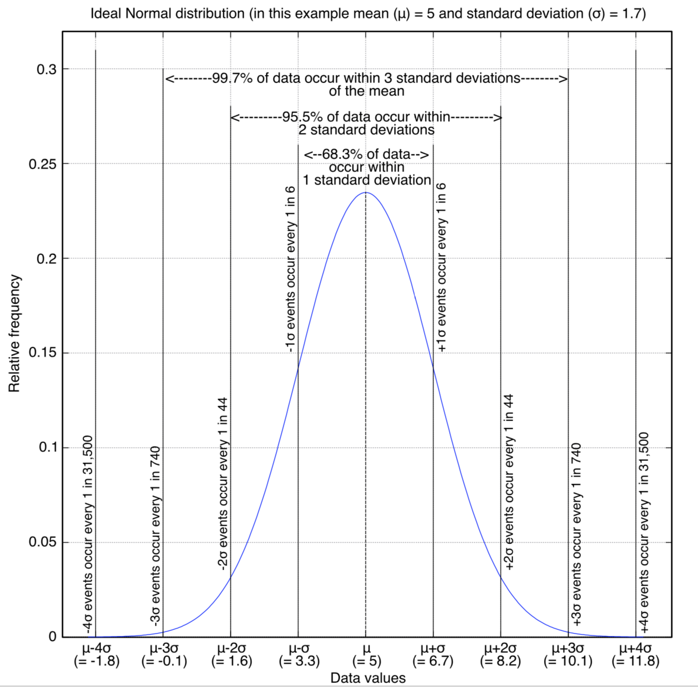
The bell curve will vary in width and height depending on the geographical area and time period being measured. The y-axis can be interpreted as “frequency of occurrence”, with the peak in the centre being the most frequently occurring value because it’s the mean.
Deviations from the mean in either direction, shown by the x-axis, represent cool or hot months for the season being plotted. To allow changes to be compared between time periods and or regions, the x-axis can be scaled as ‘number of standard deviations’ (i.e ‘Z-score’).2 The area under segments of the bell curve are shares of very cold to very hot months.
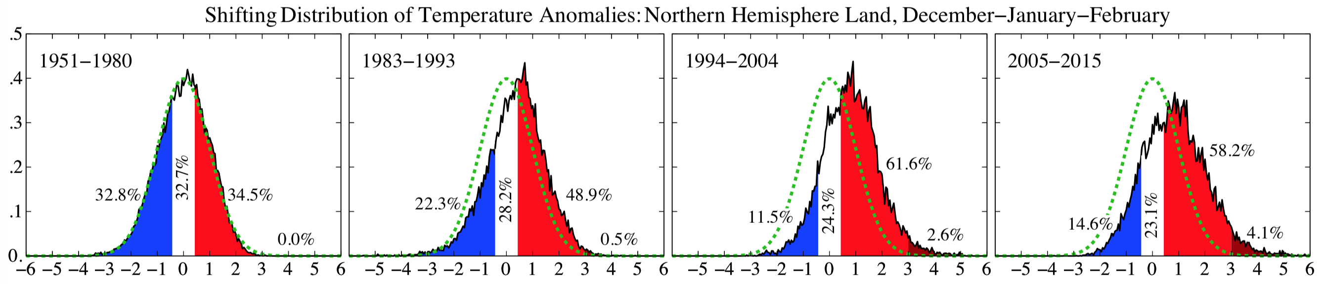
Shown below is the change of summer and winter monthly mean temperature distributions over land in the northern hemisphere, relative to 1951-80, with the latest displayed being 2005-2015. The period 1951-1980 is an often used reference period.
… the period 1951–80 is defined as a baseline for changes in heat extremes. This baseline has the advantage of having been a period of relatively stable global temperature, prior to rapid global warming, and of providing sufficient observational measurements such that the climatology is well defined.
World Bank. 2013. Turn down the heat : climate extremes, regional impacts, and the case for resilience.3
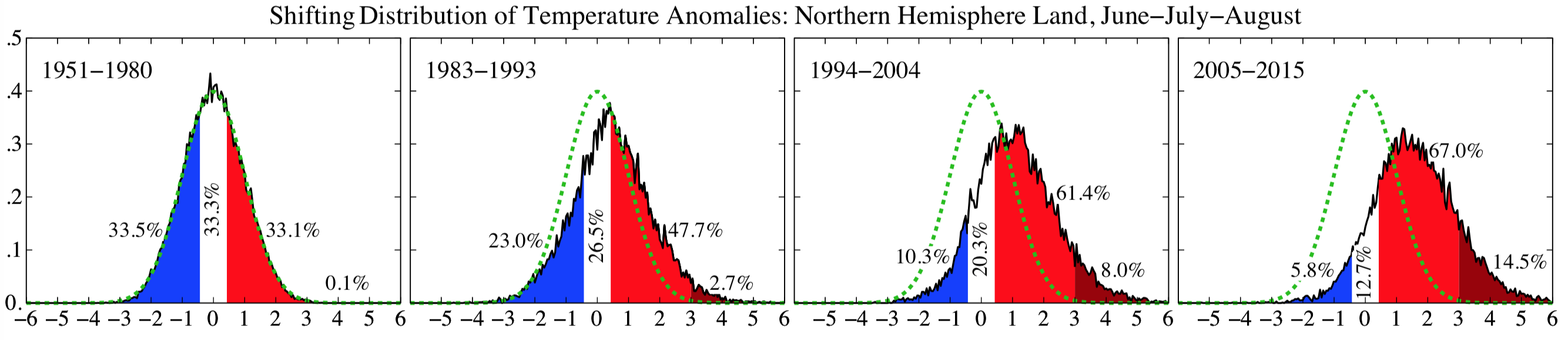
Since 1951-80, the share of northern hemisphere summer months categorised as ‘cold’ has decreased from 33.5% to just 5.8%, and the share of ‘very hot’ months has increased from 0.1% to 14.5%. The share of hot months has doubled.
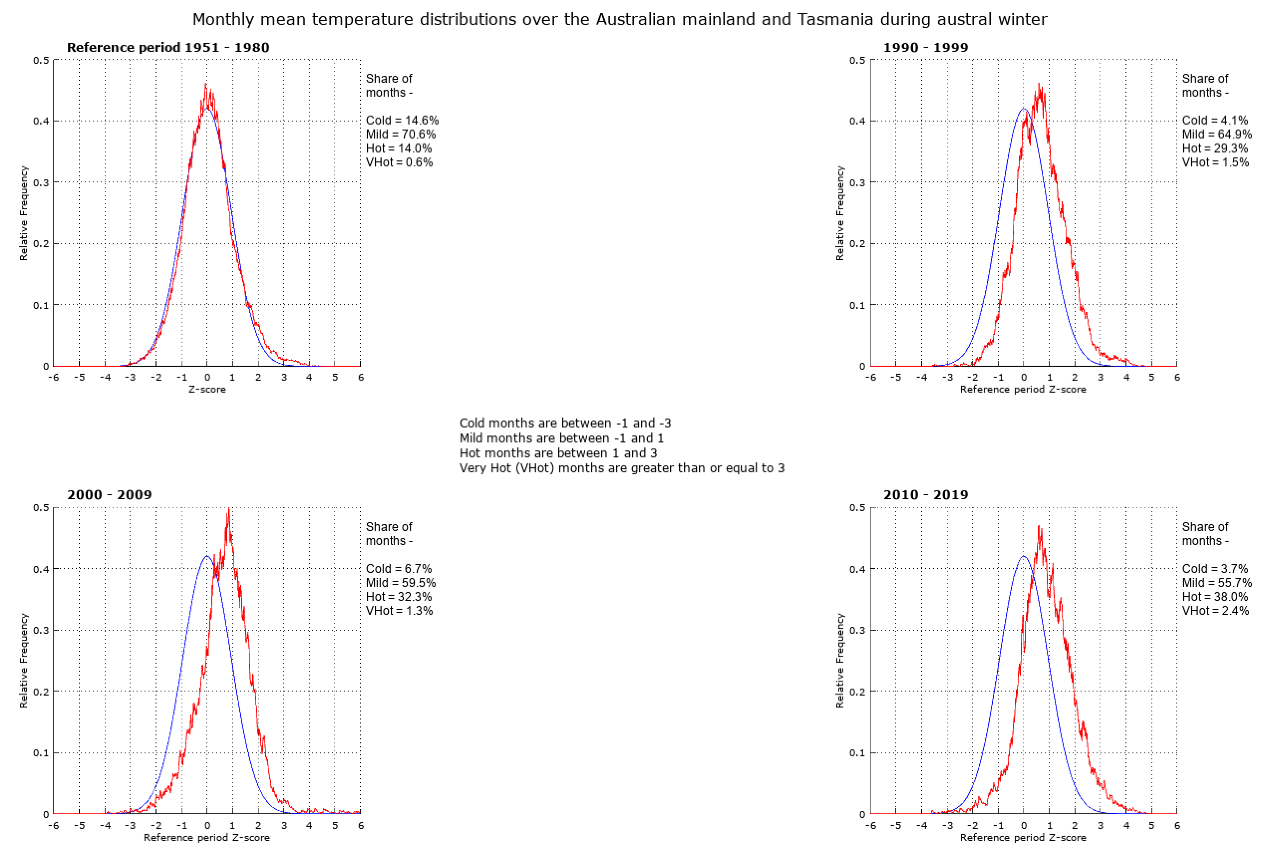
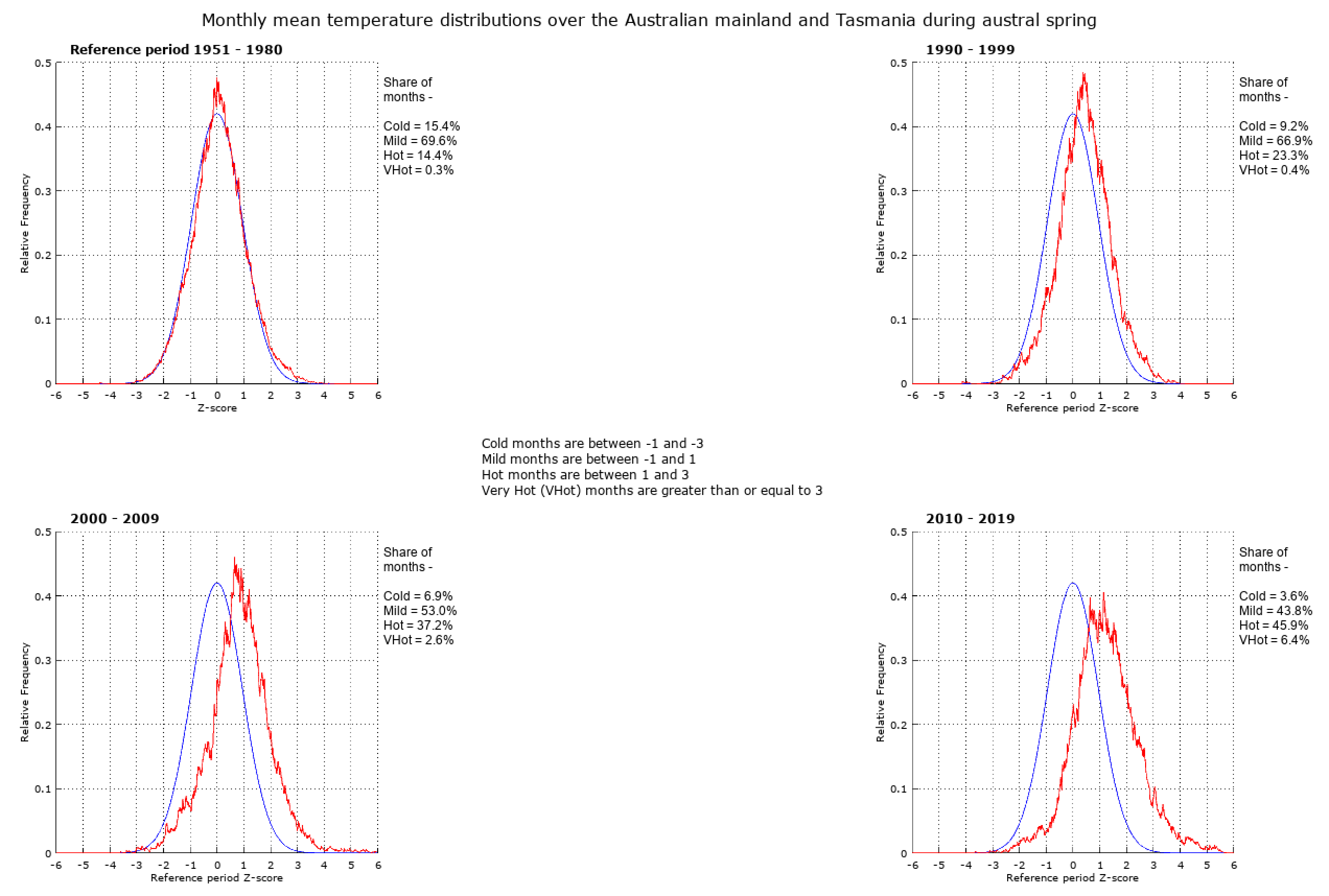
The shifts of monthly mean temperature distributions over each hemisphere and various regions are shown below.
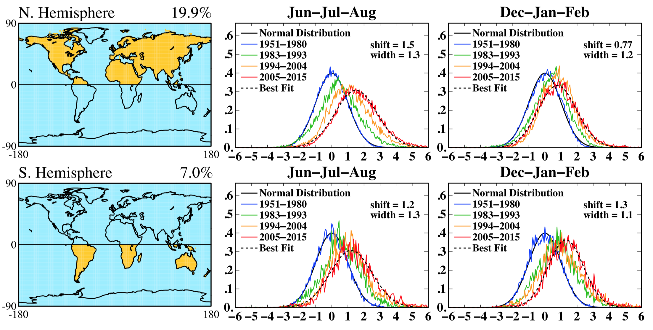
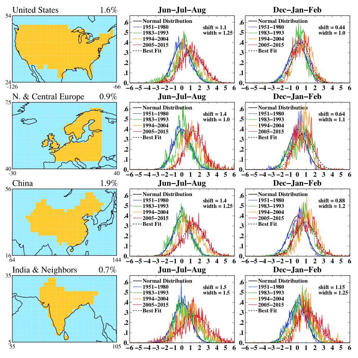
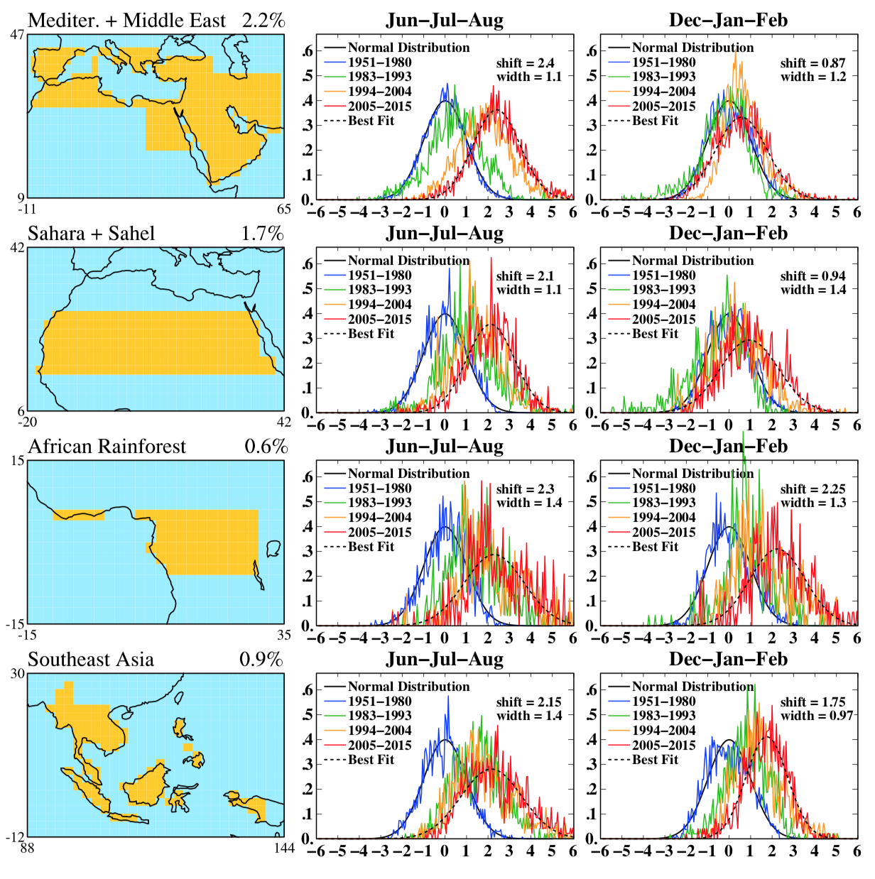
Note that over the African rainforest region and south east Asia, almost half of the months of each year between 2005-2015 were so hot, that they never occurred during 1951-1980. The same applies to summer in the Mediterranean and the Middle East.
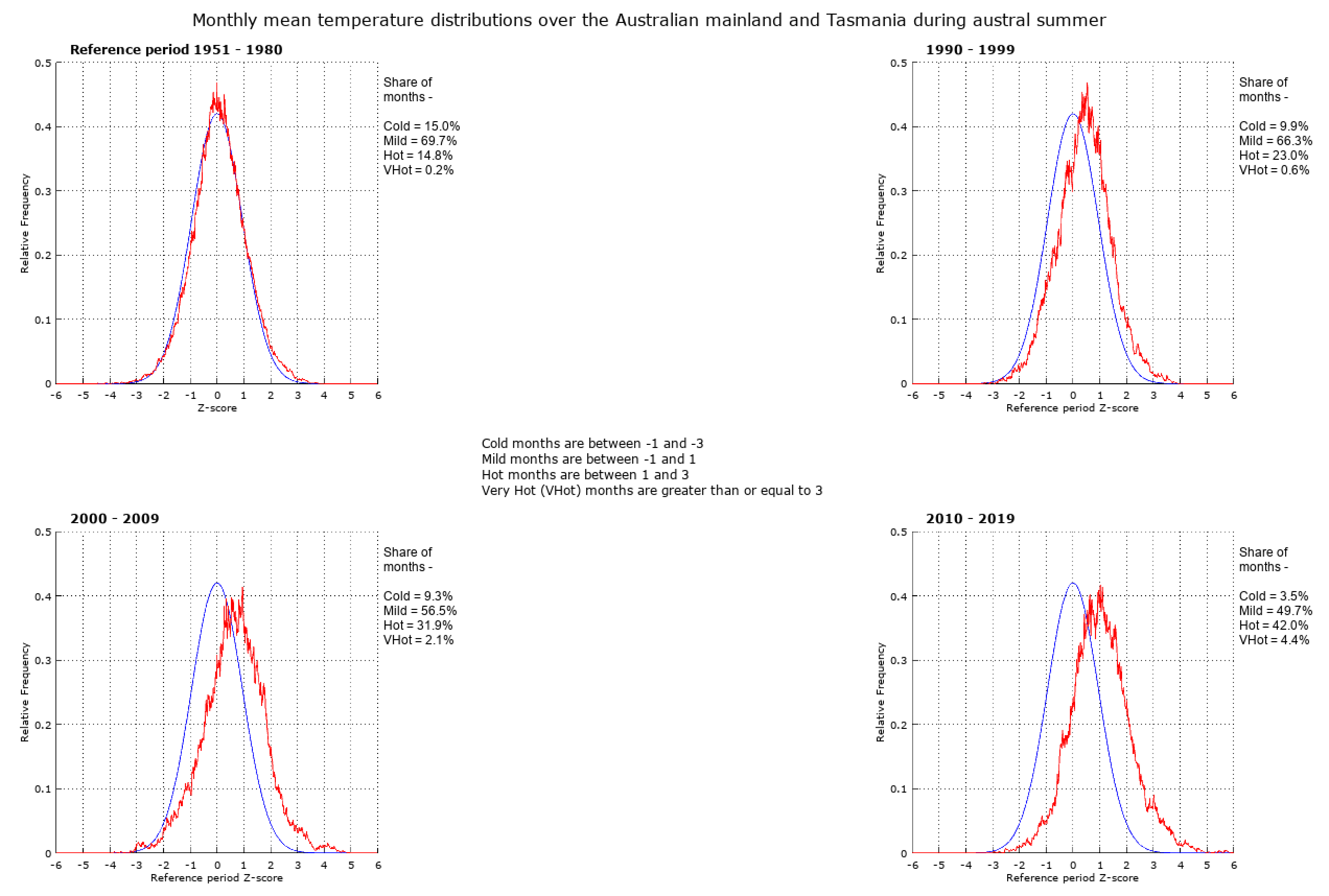
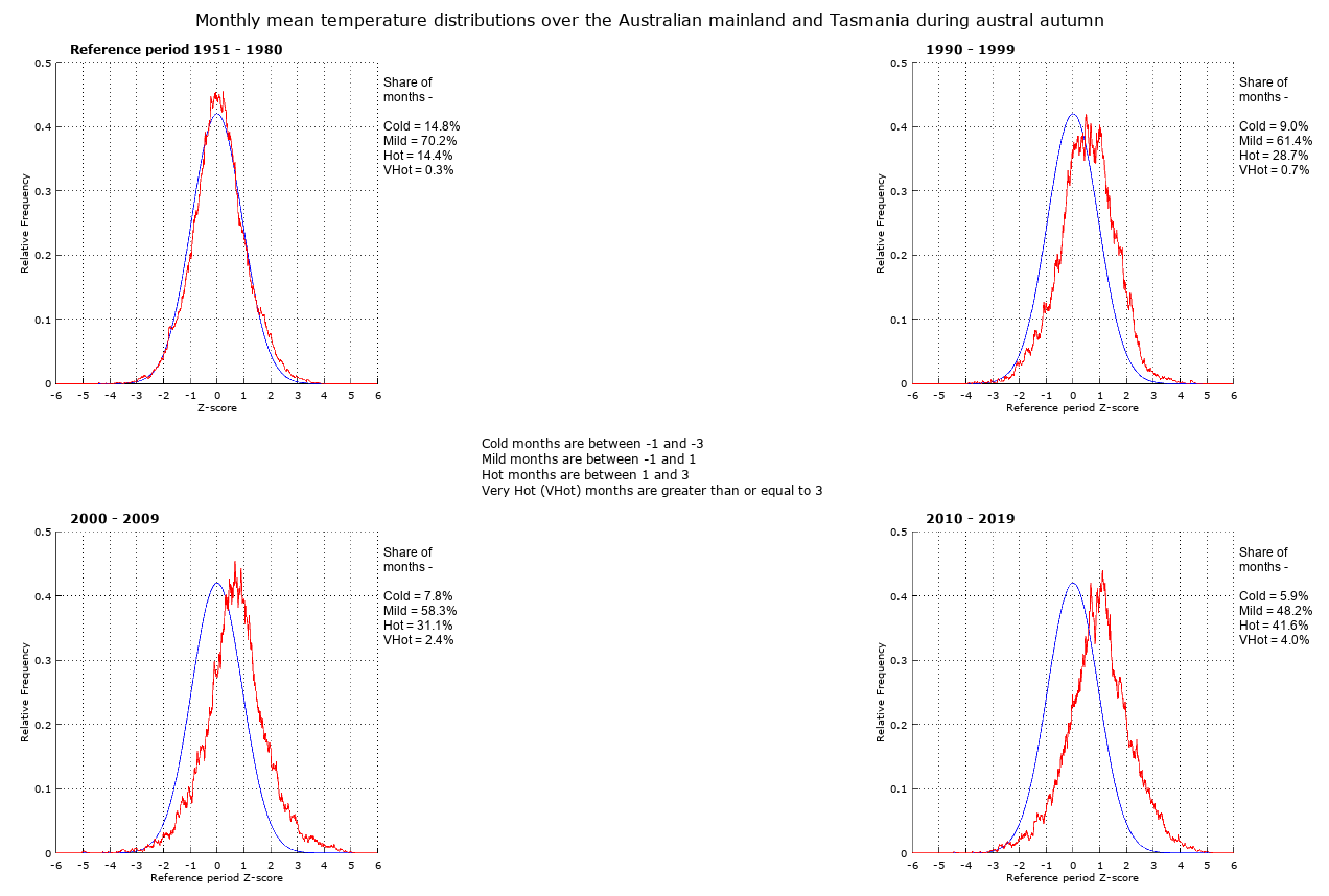
Over the Australian mainland and Tasmania, between 1951-80 and 2010-2019, in all seasons, the share of cold months has decreased by about two thirds and the share of hot months has increased from about 14% to 40%. The share of very hot months has increased from a negligible amount to 4% in summer and autumn, 2% in winter and 6% in spring.
The shifts of monthly mean temperature distributions shown on this page are the consequence of 1.0˚C global mean surface air temperature as of 2015, and 1.1˚C in 2019, with respect to 1880-1910.10 The current policy of governments worldwide will result in 3.3˚C+ 11 and much larger shifts of temperature distributions.
Anthropogenic greenhouse gas emissions are a rapid planetary geoengineering experiment, without any plan, and without any known analogue.12
- https://en.wikipedia.org/wiki/Normal_distribution[↩]
- https://en.wikipedia.org/wiki/Standard_score[↩]
- p. 10, Adams, Sophie; Baarsch, Florent; Bondeau, Alberte; Coumou, Dim; Donner, Reik; Frieler, Katja; Hare, Bill; Menon, Arathy; Perette, Mahe; Piontek, Franziska; Rehfeld, Kira; Robinson, Alexander; Rocha, Marcia; Rogelj, Joeri; Runge, Jakob; Schaeffer, Michiel; Schewe, Jacob; Schleussner, Carl-Friedrich; Schwan, Susanne; Serdeczny, Olivia; Svirejeva-Hopkins, Anastasia; Vieweg, Marion; Warszawski, Lila; World Bank. 2013. Turn down the heat : climate extremes, regional impacts, and the case for resilience – full report (English). Turn down the heat. Washington DC ; World Bank. http://documents.worldbank.org/curated/en/975911468163736818/Turn-down-the-heat-climate-extremes-regional-impacts-and-the-case-for-resilience-full-report[↩]
- James Hansen, Makiko Sato, and Reto Ruedy, PNAS September 11, 2012 109 (37) E2415-E2423, https://www.pnas.org/content/109/37/E2415[↩]
- http://www.columbia.edu/~mhs119/PerceptionsAndDice/[↩][↩][↩][↩]
- Hansen, J. and Sato, M., 2016. Regional climate change and national responsibilities. Environmental Research Letters, 11(3), p.034009, https://doi.org/10.1088/1748-9326/11/3/034009[↩][↩][↩]
- https://data.giss.nasa.gov/gistemp/[↩][↩][↩][↩]
- https://www.gnu.org/software/octave/[↩][↩][↩][↩]
- https://github.com/shanewhi/Temperature-Distributions-Shifts/tree/master/Australia[↩][↩][↩][↩]
- figures quoted are obtained from https://data.giss.nasa.gov/gistemp/graphs/customize.html using: Data Source = Land-Ocean: Global Means, Base Period = 1880-1910, Smoothing Window[↩]
- https://www.worldenergydata.org/current-path/[↩]
- https://www.worldenergydata.org/existential-threat-pt1/[↩]